Case Study

Social Trip Planning App Feature Integration

 
Project_Logos-19.png
 

Client

Yelp

Timeline

2 weeks

Role

UX Researcher/Designer
Interviewer
Data Analyst

Tools

Photoshop / Illustrator
Sketch + Craft
Marvel


ProjectBrief_Icon-09.png
 

Project Brief


In this exploratory project with Yelp, my team was challenged with integrating a new feature into their current mobile app. Yelp's goal was to increase user engagement by appealing to travelers and offering a way to plan a trip and share your itinerary with others.


Problem_Icon-10.png
 

The Problem


Social media is now fully ingrained into the travel process. From communicating with friends, to posting about your trip, to even planning your day, social media has changed the way we travel. However, there is a disconnect between apps that determine what you do on your trip and how you share it.


Opportunity_Icon-11.png
 

Opportunity


Users desire resources and applications that can simplify and condense that vacation planning and booking process. However, with an app for every step of the vacation journey, users are overwhelmed with the quantity of options. How might we add a feature to Yelp that consolidates the traveling process while incorporating a social media element to Yelp’s massive library of business reviews and services?


Deliverables_Icon-12.png
 

Deliverables


Conducted UX research analysis and designed a Collaborative Trip planning feature within Yelp's existing App as an integration. We delivered an Interactive Prototype of the final design concept, and presented our research and test results to the client.


Discovery_Icon-13.png
 

Discovery Methods


Screener Survey | 29

User Interviews | 6

Market Analysis

Personas | 3

Task/User Flow

Feature Prioritization

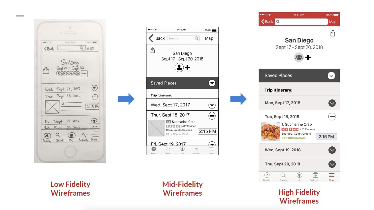
Mid/Hi-Fidelity Wireframes

Paper Prototype

Interactive Prototype

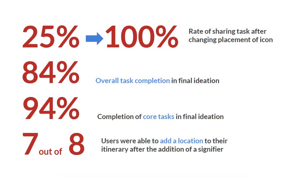
Usability Tests | 25

Iterations | 7


Solution_Icon-14.png
 

The Solution


We wanted the entire planning process to be quick and easy to use, especially for someone on the go. Placing the information and action elements where they fit best in the existing Yelp layout would make it easy for someone who was already familiar with the app. We also wanted to include enough helpful features to justify the process to someone who may already have a preferred way to plan trips. This was all in hopes to further engage and expand Yelp’s user base, as pointed out by the company in our prompt.

Website_Banners-14.jpg

Key Features:

  • Collaborative Trip Planner

  • Itinerary

  • Map function

  • Friend Recommendations

  • Sharing Functions

 
DividerBanner-07.jpg

The Research


Background

Yelp is an American multinational corporation headquartered in San Francisco, California. It develops, hosts and markets Yelp.com and the Yelp mobile app, which publish crowd-sourced reviews about local businesses, as well as the online reservation service Yelp Reservations. The company also trains small businesses in how to respond to reviews, hosts social events for reviewers, and provides data about businesses, including health inspection scores.


Discovery Journey

We started by going back to the drawing board and redefined our Mind Map of potential Yelp users to refine our Screener Survey and proceeded to prepare our Interview Script. We also did some research in Yelp’s existing app features and other travel planning solutions currently in the market.

In our screener survey, we now had to recruit users that also planned travel in addition to using Yelp’s app. We received 29 survey submissions and based on our criteria, we ultimately conducted 6 qualifying interviews.

In my interviews with each user, I guided our conversation with some basic questions such as:

  • Tell us about your process for planning a trip
  • Do you use any technologies that help you with that?
  • How do you use the Yelp app?
1_6y50W4c8XJ-OqtSOo6-j_A.jpeg
1_bF7A78eP-WcgdbnQRi1n2A.jpeg
1_K0VDv3D9609tCNn70FsdSg.jpeg

Key Insights

After we interviewed users, we synthesized the key insights that we found into an Affinity Map to identify the Problem Statement and formulated our target Personas. In our findings, we were able to identify the most common pain points and user needs:

Pain Points

  • Too many options to plan travel and find things to do
  • Unreliable review sources
  • Inefficient travel planning takes away enjoyment during trip

Needs & Goals:

  • Single platform for trip planning that’s multifunctional, easy to access and seamlessly integrate with other apps
  • To incorporate the social media process with her itinerary

Problem Statement

Social media is now fully ingrained into the travel process. From communicating with friends, to posting about your trip, to even planning your day, social media has changed the way we travel. However, there is a disconnect between apps that determine what you do on your trip and how you share it.

Users desire resources and applications that can simplify and condense that vacation planning and booking process. However, with an app for every step of the vacation journey, users are overwhelmed with the quantity of options. How might we add a feature to Yelp that consolidates the traveling process while incorporating a social media element to Yelp’s massive library of business reviews and services?


User Personas:

The user personas below were gathered from the insights of the interviews that we conducted. We found that the Primary and Secondary Users would more likely be a user for this new feature integration.

1_6NtpUQbPeM3qGdYl0ZS5Zg.jpeg
 
DividerBanner-07.jpg

Prototyping


Design Ideation

We began our design process with a few Design Studio sessions to formulate a Design Strategy. Our team completed 4 different design studio sessions. In this ideation process, we rapidly sketched various concepts that would accommodate the needs of our Primary User as well as keeping our Secondary User in mind.

We wanted the entire process to be quick and easy to use, especially for someone on the go. Placing the information and action elements where they fit best in the existing Yelp layout would make it easy for someone who was already familiar with the app. We also wanted to include enough helpful features to justify the process to someone who may already have a preferred way to plan trips. This was all in hopes to further engage and expand Yelp’s user base, as pointed out by the company in our prompt.


Design Strategy

As our concepts became more complex, our features list began to grow. To finalize our design concept and focus on the Primary User, we put our heads together using the MoSCoW (Must, Should, Could, Would Not) mapping technique to determine our Feature Prioritization list.

With this method we were able to pinpoint the core features that we needed to implement in order to accommodate our Primary User’s needs as well as meet our client’s business goal. We narrowed down our long list of:

Must Have Features

1. Collaborative Trip Planner
2. Itinerary
3. Map function
4. Friend Recommendations
5. Sharing Functions

Following our synthesis, design studios, and MoSCoW prioritization, we moved onto reorganizing the layout, drafting a user flow, and creating a paper prototype. These were used in our first set of user tests, which allowed our mid-fi prototypes to be further refined in line with our user’s needs.


1_OVT0sU-yHQKlmTkxqHk4Yg.jpeg

Design Iterations

In the next phase of our design process, we practiced Rapid Prototyping and conducted a series of Usability Tests to gain user feedback in iterating our Wireframes from Low-Fidelity to Mid-Fidelity and even Higher-Fidelity Prototype designs.

Based on user test feedback, we iterated our wireframes from Low-Fidelity to Mid/High-Fidelity a total of 7 times to improve upon the ease of use and users’ understanding of the Design Concept.

The Low-Fidelity paper prototype helped us work out the user flow, navigation and some of the button placements. As we moved into the Mid-Fidelity wireframes, we we able to refine a lot of the aspects where users would get lost by changing verbiage, adding signifiers, adjusting call to action buttons. In our final Higher-Fidelity prototype tests, we were really able to refine key indicators and improve visibility of design features with the usage of key color indicators and placement changes.

1_uAgz9Ku-pA-7Cap5uKZVgA.jpeg

Key User Test Insights:

From various rounds of user testing, the key insights listed below lead us to some of our final design decisions that significantly improved user flow, visibility of important icons or call to actions, and overall increase in user task completion rate.

  • New users needed guidance with signifiers
  • Placement change of buttons/icons helped users get through tasks faster.
  • Color change informed icon visibility
  • Users needed indicators to confirm gestures
  • Change in verbiage resulted change in user behavior.

1_pT2Y5T-1C4SowtkW9r4s5w.jpeg

User Testing

Throughout the iteration process, we conducted a total of 25 Usability Tests. A majority of the tests were conducted through Mid-Fidelity wireframes. In our last 2 iterations with High-Fidelity wireframes, we set metrics to measure Task Completion Rates and set KPIs to meet our standards in determining test completion success.

Core User Tasks:

1. Create a new trip
2. Add a place and schedule in itinerary

Secondary User Tasks:

3. Add a friend to collaborate on your trip itinerary
4. Share your trip itinerary with someone else
5. Utilize the map function

*Task Completion Rates above are based on the last 8 user tests. Detailed figures are available upon request.

*Task Completion Rates above are based on the last 8 user tests. Detailed figures are available upon request.


Website_Banners-14.jpg

Further Considerations

This project had many interesting challenges. The biggest challenge was designing this new feature integration in a way that is not disruptive but also can be easily found amongst Yelp’s many existing features. Another challenge was understanding all the different ways Yelp users are currently using the app. There are multiple ways to search and access various existing features. This meant that we needed to find a way to streamline the new Trip Itinerary feature so our users don’t get lost in their traditional method of navigation. We also learned quite a bit on the importance of using the right labels, verbiage, placement, icon selection, the need for adding various signifiers, color choice and how it can significantly affect the usability.

In terms of next steps, our team had a long list of future developments for this features but to our stakeholders, we would recommend promoting this new feature in this design phase first to gain a steady increase of adopters prior to further development.