Case Study
New Shop by Ingredients Feature for Recipe Followers

Client
Eataly
Timeline
2 weeks
Role
UX Researcher
UX/UI Designer
Market Analyst
Tools
Illustrator / InDesign
Sketch + Craft
inVision
Omnigraffle
Project Brief
In this exploratory project, my team and I were challenged with redesigning Eataly’s online experience based on opportunities derived from thorough research analysis of Eataly’s brand, user base and website.
Eataly has partnered with Foodie Inc (Susana Charm, James White, Tawona Chimimba, Evan Tyerman to conduct full research analysis of their existing website with the goal of site redesign and optimization based on user insights.
The Problem
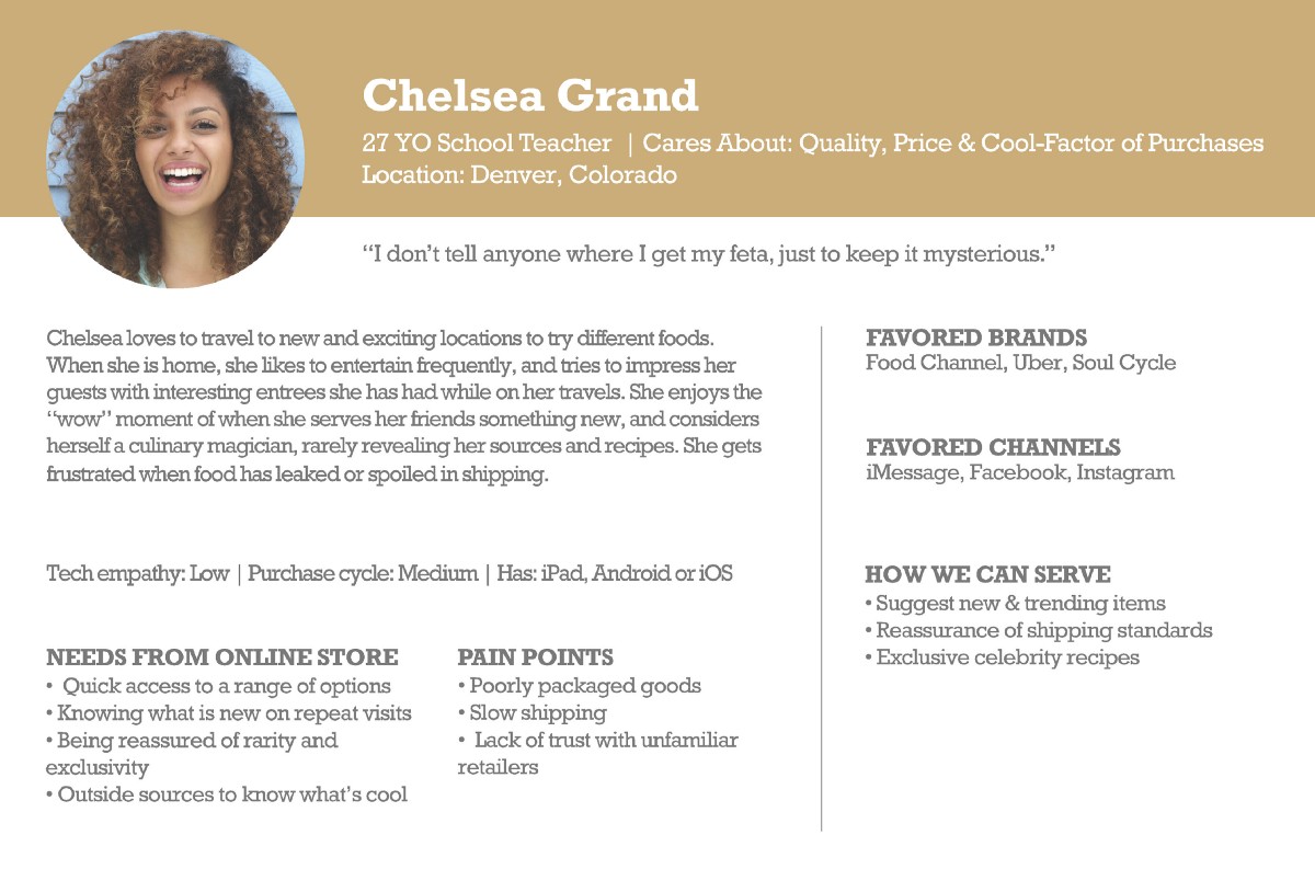
Through our findings, Eataly’s customer base value quality foods and great customer experience. Their needs seem to be met with the in store experience, however their online experience is not ideal, if they even use the website at all.
Their primary customer base wants to buy quality food items and find unique and inspiring recipes through their trusted culinary source, Eataly, however the website experience is difficult to navigate and search. How might we redesign the main navigation structure of Eataly’s website to provide a better experience for their users?
Opportunity
Streamlining Eataly’s “Learn” & “Shop” experiences.
Enhance the experience of Eataly’s Recipe feature and integrate it with their online food shopping experience.
With a better navigation and “Add Recipe Ingredients to Cart” feature, not only will there be better user engagement but potential increase in online food shopping with Eataly’s recipe followers.
Deliverables
Research Report | Competitor Analysis, Heuristic Analysis, Competitive Analysis, User Research, Site Map, Inventory List, Task Flow, Next Steps
Specification Documentation | Research Insights, Site Map, Inventory List, Task Flow, User Flows, User Journey, Annotated Wireframes, Usability Testing, Invision Prototype, Next Steps
Client Presentation | Market Overview, Problem Statement, User Personas & Journey, Research Insights, Opportunities, Design Strategy, Usability Test Insights & Metrics, Prototype Demo, Next Steps
Discovery Methods
Contextual Inquiry
In Store/Online
Screener Survey | 21
Site Usability Tests | 4
Heuristic Evaluation
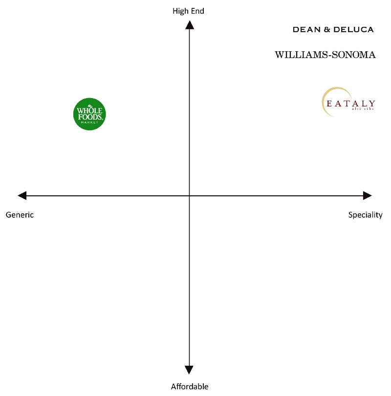
Competitive Analysis
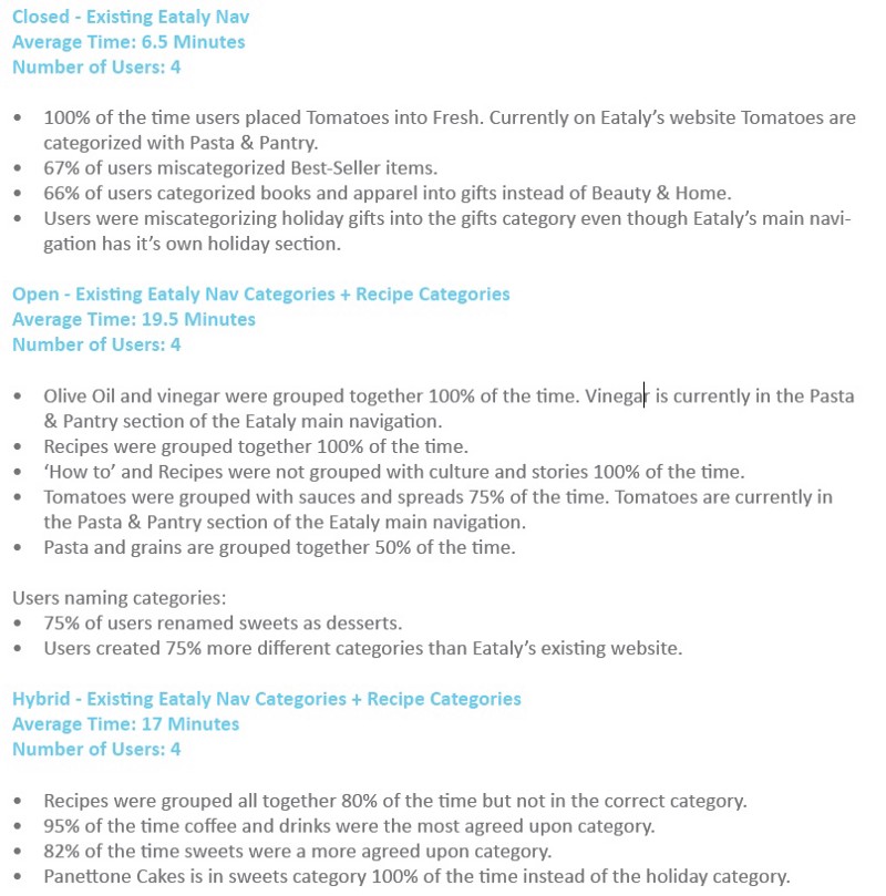
Card Sorting | 12
Site Mapping
User Journey
User Flow
Feature Prioritization
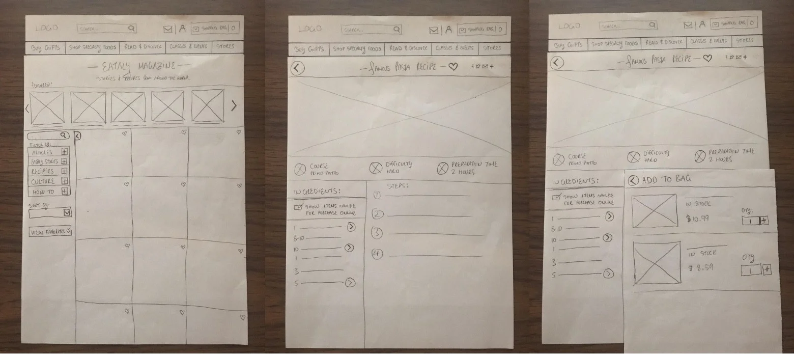
Mid-Fidelity Wireframes
Paper Prototype
Interactive Prototype
Proto Usability Tests | 8
Iterations | 2
The Solution
An overall goal of an Eataly Online Shopper is to look up recipes and purchase to ingredients for it.
With Eataly's enhanced recipe browsing and new Shop by Ingredients feature, their online shoppers would be able to purchase ingredients with ease and potentially gain new customers through their recipe followers.

Key Features:
Reorganized main navigation categories
Direct link to recipes
Filters on the Magazine page & favoriting
New feature integration: Add available ingredient to bag
Additional filters for main food categories
Related Recipes feature under food item